CHARTING DATE RANGES
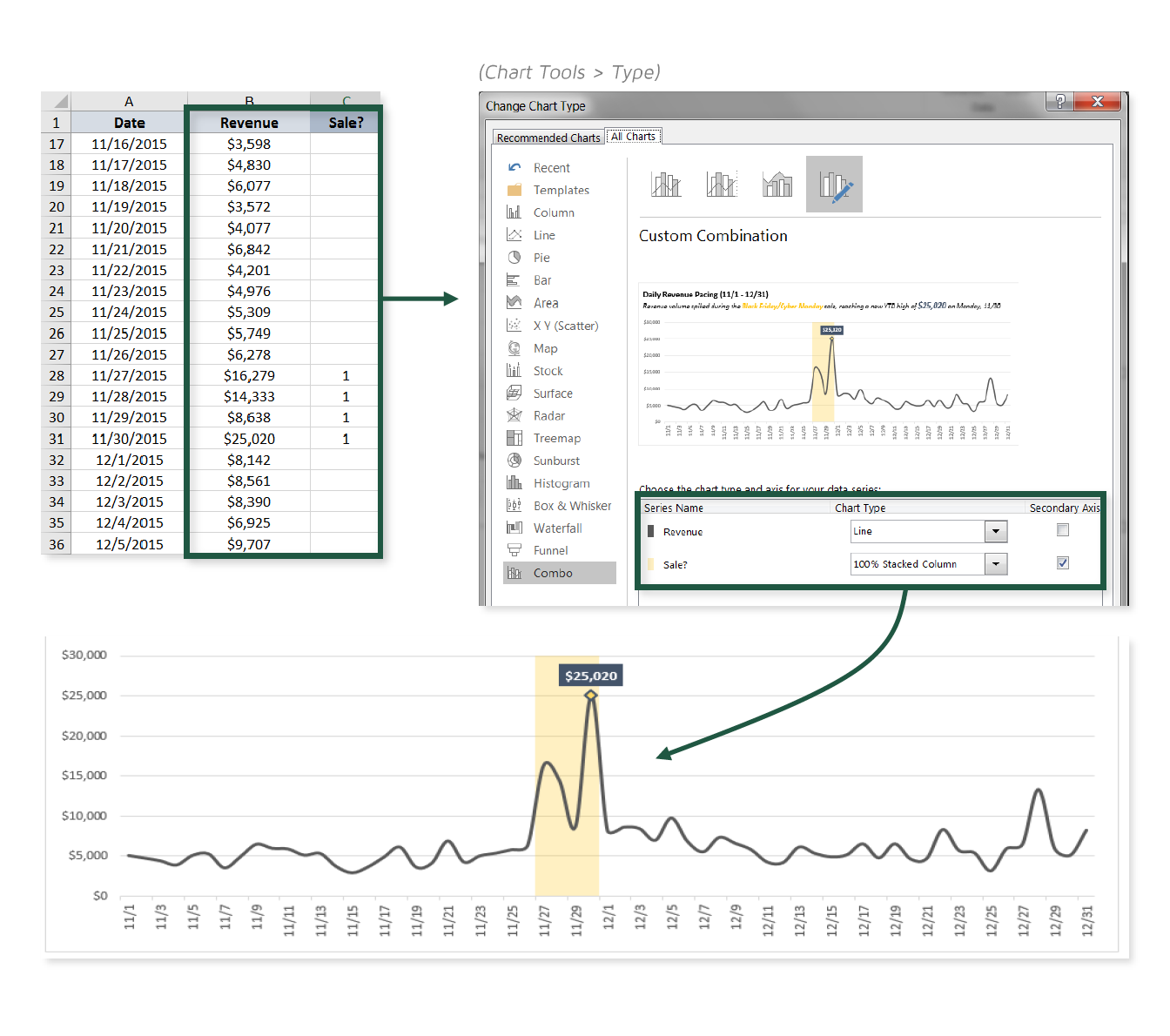
One of my favorite things about data viz in Excel is that you can mash together all sorts of chart types to create Frankenstein-style visuals. Generally this sort of experimentation will lead to ugly, confusing, or just plain ridiculous results, but with a bit of practice you’ll begin to discover some truly interesting and powerful combinations.
In this tip, we’ll practice combining a line chart with a 100% stacked column to draw attention to specific time periods within our sample sales data.

COMMON USE CASES:
- Highlighting sales or promotional periods to add context to charts
- Drawing attention to seasonal patterns or trends (i.e. peak vs. off-peak, weekends vs. weekdays)
📤You download App EVBA.info installed directly on the latest phone here : https://www.evba.info/p/app-evbainfo-setting-for-your-phone.html?m=1


![[Free ebook] Excel Timesaving Techniques For Dummies](https://blogger.googleusercontent.com/img/b/R29vZ2xl/AVvXsEgzWyqaPosaS2VM-Nk1ab24vcKUwYTs711ThM9wp9xmavw0A3qGwRFO810Ck-OdOWZcBBky6MTqkpWRXlaZBidjaesv3AhqgLAVXQ-jUZj8erqehdQDFbSg8s0XB72D162a5fdjoeCaXCU/s72-c/2019_04_15_14.32.34_edit.jpg)
![[FREE EBOOK]101 Ready-to-Use Excel Formulas by Michael Alexander & Dick Kusleika](https://blogger.googleusercontent.com/img/b/R29vZ2xl/AVvXsEjlgcYWkmfYQbPJ8_2JubQnnsTSWEba0oUXWpGF53A6EOj30ZsVldkShWT3woS6WnNIDHMuTkRGl2Fnj8e86GA7-PRE1HEhKN6Yw_gJe00lzcxRpCXafd4IRO97ehk3PNQybVPn3k4q7r8/s72-c/101+Ready-to-Use+Excel+Formulas+by+Michael+Alexander+%2526+Dick+Kusleika.jpg)
![[Free ebook Download]Excel Formulas & Functions For Dummies by Ken Bluttman](https://blogger.googleusercontent.com/img/b/R29vZ2xl/AVvXsEhYetQg74WpM626jRfy2FNrD3T272FyEaS-6p2mBfAgithEES51mLuj76s7JDCrkb8SuwiaST1s6mox68MC6IwJYWkiFH6rRXYqnc513XGjRdYjeviLZii14QmxmThmh2D_ItCW1YTvd2k/s72-c/Excel+Formulas+%2526+Functions+For+Dummies+by+Ken+Bluttman.jpg)

![[FREE EBOOK DOWNLOAD]Excel Data Analysis For Dummies by Paul McFedries](https://blogger.googleusercontent.com/img/b/R29vZ2xl/AVvXsEgLCDTLwgLtY0xfs-YAIKyDdKhMVSIKsrnjL-GtIYwV7BD7oqVTMWc3cTR73ps7GtjNrZB5v84xN5ROGdf9_YW1oeTiV4mgMeIdfV7LZOiEBbJuY15C7Qch4jNUYd6Eb3oE_xmQUSrdfCI/s72-c/Excel+Data+Analysis+For+Dummies+by+Paul+McFedries.jpg)
![[FREE EBOOK]Excel Formulas & Functions For Dummies, 5th Ed. By Ken Bluttman](https://blogger.googleusercontent.com/img/b/R29vZ2xl/AVvXsEjdoqrCzzIOuNJbvUH5MEY1YxOxUOFgEryEJ9qqxXoz_q8tpXdTXpqlw8byu_e9mr68In_O-gqRSMR1BsK6QZu_yNYfUqgEgU0nq3fzjHLngvxWo1xpHMG7TmzBLz3CbjwQT92f8AN2D9c/s72-c/2020_04_13_17.39.05.jpg)
![[Free ebook]John Charnes – Financial Modeling with Crystal Ball & Excel](https://blogger.googleusercontent.com/img/b/R29vZ2xl/AVvXsEiPP0330djpk28pL5LZlqnuEaIplflr5MdFS78ohWpHrWhis4Fy49pyqGS3jAqINNEwiqnNifTCRJgTlxVr5wJfaozf7SUX_tFXmD9grSAoXyOyZQjt2GdaryCkMlqJW0B3NAujFatY7gw/s72-c/395-1.jpg)

![[Free ebook]Excel Dashboards and Reports for Dummies 3rd Edition - Michael Alexander](https://blogger.googleusercontent.com/img/b/R29vZ2xl/AVvXsEh9vLm6q3B9PFEAcLnQ4YrI5pH_KCv-CcunxTBBHZXcbA9rhd2RR2HchlVAguPCGRJupUJesFUkaff2DX7MCqOFwfLHU6LkePD5KMPLZB6V_9Xe64x9p_ntwaFpJMAsjYPaL1sUVMwzhuc/s72-c/2020_01_20_22.10.34_edit.jpg)
No comments:
Post a Comment